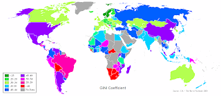
 The Gini coefficient is an interesting number. It ranges from 0 to 1 and shows how equitably the GDP of a nation is distributed amongst its citizens. 0 is the most equitable and 1 is the least. The index is not very clear but some examples are : Purple is around 0.5, Cyan is 0.35, Red is greater than 0.6, light green is 0.35 and pink is about 0.55
The map on the left shows how different countries fare on this scale. The capitalist mecca is purple, where you would expect a big difference between the rich and the poor, a hallmark of capitalism. However, Canada and Australia are light green, which might come as a surprise. It shouldn't actually since even though these countries are developed and progressive, the salaries are only a fraction of what high ranked executives get in the US. The poor probably earn about the same as they do in the US. Hence the ratio lowers. South Africa is bright red, which correlates to a very rich white population and a majority of poor blacks. It is interesting to see that China is also purple like the US. That should be an eye-opener. In spite of a communistic regime, China has opened its gates to privatization and capitalistic forces in several sectors. That clearly has colored it purple. India is light blue, like Japan. However the reasons couldn't be far from different. Japan has a very strong social security net that covers most of its citizens in times of unemployment and disabilities. The salaries of top executives are not outlandish like the US either. Hence, a reasonably equitable distribution. However, in India, it is light blue not because of a social net (it does not exist) or welfare programs. It is because 70% of India's population works in agriculture and manufacturing and earns modest wages. The light blue exists since most of the people are collectively poor rather than collectively rich.
1 comment:
I guess they need more colours and a detailed legend to prevent misinterpretation of this map!
Post a Comment